in what ways does your media production use ,develop or challenge forms & conventions of real media products ?
In this question we will discuss how we have used, changed, developed or challenge conventions by compared our products to real media text, as well as compared our products to real media text and explain how different conventions have been used. We will also show how will took inspiration from existing horror content and incorporated the ideas within our final products to create professional pieces. Analysing conventions allowed us to choose the right technique to aim to our target audience in order to meet expectations. Discussing whether or not we chose to use certain conventions and explaining why we have used them demonstrates why our products look the way they are. It also shows the process of how we created our final products.
Textual analyse and print design are the tasks that will be used to tackle this question; textual analysis explains the symbolic reference of certain conventions and the effect that have on the audience and print design explores and explains the graphology of the conventions and why they are positioned in that way.
This question will be structured by explaining what conventions are, how real media horror content use conventions through convention diagrams and showing how we have used conventions through convention diagrams and a detailed description.
how we have used real media conventions to create our products, magazine, poster and horror trailer .

m a g a z i n e
magazine convention diagrams


Website: The website could be combined with other conventions like in this example where the website is with the barcode. This makes it easier to fit all needed conventions on the front cover.
Strap Line: Italian Horror! America Terror! German Core! located above the masthead. As well as 'GIANT FOLD-OUT POSTER INSIDE!'. This convention has been challenged and developed in this example because its been used in two places. Price: Combined with the barcode and other conventions. Date Line: Convention followed; Its small next to the masthead. Celluloid Film Strip: Convention followed: Its used at the bottom of the magazine. Issue number: Convention followed; 'fangoria 302' near the masthead. |
Masthead: In this Horror magazine the masthead uses traditional methods by making the masthead bold and red to make it stand out among the other conventions.
Main Image: The main image is a collage of horror film antagonists. It goes against traditional convention where the main image covers the whole page. Barcode: In this example the Barcode follows the traditional convention where its small in size and is placed in the bottom right corner. Puff: It follows the traditional convention, however phrases could be more persuading. Cover Line: ' THE HUMAN CENTIPEDE ' Selling Line:'8GREATFREEGIFTS!' and 'SEASONTHREESECRETS!' Main Coverline: ' BIG SCREEN SCARES! ' 
|
abduct magazine convention diagram

|

|
hOW WE HAVE USED/FOLLOWED CONVENTIONS:


|
Masthead: A masthead is one of the most important conventions we have use within our magazine. The masthead is the name of our magazine 'abduct'. We have followed this convention traditionally by positioning the masthead at the top of the cover and making it fix across both corners of the magazine. Usually the masthead is unique in style with edited letters that suit the genre. We have followed this technique by using an 'impact like font and changed it to look horrifying.
Coverline: 'BOBO: HORRORS NEW CLOWN' and 'SNAP: TEEN BASED HORROR' are some conventions we have used in our magazine. This convention was followed by surround the coverlines around the main image to frame the antagonist' face. Main coverline: Our main coverline promotes the movie of our trailer 'Uploaded'. Like the Fangoria magazine we have placed the main cover line directly under the main image. This convention was also followed by associating the main image with the cover line to captivate our target audience. Main Image: Our main covers the whole magazine cover and is layered with other conventions so we have successfully followed this convention ; a disturbing image was used which suit the horror genre theme. Celluloid film strip: The celluloid strip was used to show clips of the movie/ trailer. This convention is used in different ways but we have just used it as a film strip that visually explains the main coverline. Barcode and QR code: Using a QR code and a barcode gives our magazine a professional appeal; the audience associate this with identity and it's what makes the magazine unique. The purpose of the QR code is to direct the audience to more content about the movie. Selling line and Strapline: Both conventions have been used and positioned in the same way as other horror magazine. Social media icons: Social media icons placed at the bottom of the magazine. It has been used to address to our audience that we try to reach a wide demographic. Using these icons also makes the audience interact the the magazine. The icons are very small compared to the other conventions used ; we wanted the icons to be noticeable but not distract the audience from the most important conventions like the main coverline and the masthead. Puff: We have used a puff 'BEHIND THE SCENES' to follow the convention. Extra information about the content of the magazine was used to tell explains to the audience the exclusive information that the magazine has. Using this convention also allows the content to stand out among the others. |


HOW WE HAVE developed CONVENTIONS:
|


|


HOW WE HAVE challenged CONVENTIONS:
|
Making the celluloid strip green and changing the colour of the main image to night vision are the two main conventions that were changed to show originality. The main image has been edited by increasing the noise (grain), adding a night vision filter and adding a cam recording frame around the main image. We wanted the social media concept to be the main aspect of our synergy so the audience can recognise that all our products (teaser trailer and magazine main article) are related.
The celluloid film strip was changed. We added a green tint on the strip and made the images black and white so the convention wouldn't over power the others however, we wanted to make a contrast with the night vision effect. The spacing of the cover lines were changed so that the main image could be the main focus of the magazine, Usually cover lines are positioned closer together in a horror magazine but we have create big gaps between each cover line and the main cover line. |

|


comparison with real media text
This is a diagram that shows the comparison between the Fangoria magazine (real media text) and our horror magazine Abduct.
Abduct difference |
similarities |
fangoria difference |

Overall, our magazine has many similarities with Fangoria however, our magazines has a price near the QR code. A price makes it easier for us to target at specific audiences ; those who can afford £2.40, young teens and youth aged 15 +.
Social media icons are another convention that Fangoria didn't use but we included in our magazine. They tell the audience that you can interact with our magazine through social networking sites. The social media icons are located at the bottom of the main cover but above the celluloid film strip so there is no graps and our conventions are evenly spaced.
The Fangoria magazine include a puff and they have followed the traditional way of positioning the issue date and issue number, compared to our magazine where we have positioned the issue number and date at the bottom of the magazine.
f i l m p o s t e r
FILM POSTER CONVENTIONS


|
Film title: Cabin in the woods is the name of this film. A simple times new roman font has been used against a contrasting background which has been over exposed.
Release date: This film poster had included a release date 'April 13'. It has been placed right below the credits so it stands out among the convention. Tagline: 'You think you know the story' is on a separate line among all the other convention ; the tag line is meant to be a catchy phrase that makes the viewers think about the storyline of the film, so it is placed by it self for suspense. Credits: Like all film posters the credits are very small and hard to read. Company logos: This poster only has one company logo. Imagery: A abandoned cabin has been used as imagery. It reflects the name of the film 'Cabin in the woods'. |
|
Hashtag: Instead of social media icons the film poster has a hashtag which is another way for the audience to interact with the film.
Pull quote: A pull quote has not been used in this poster however, pull quotes are used to further persuade the viewers to watch the film because they are able to see other people's opinion. Website link: The website link is located right at the bottom of the poster. Websites or web pages are sometimes create for the film so views can see behind the scenes and other cross media services. Coming soon: Coming soon was used in this poster instead of a release date because it sounds ominous. Actor name: Used in deliver us from evil , following traditional methods of placing the actor names at the top of the film poster. |

UPLOADED film poster convention diagram |

|

|
how we have used/followed conventions


|
Film title: Uploaded is the title of our film. A film title is an important convention so we had to use this convention otherwise, the audience wouldn't know the title of our film.Also, the film title appeals to our target audience, social media users so without the title the audience won't be able to determine the genre of the poster.
Festival awards: Used to show the audience how presitiages our film is. Having a official opinion will make the audience more comfortable when watching the film because they can see that officials have approved the film. Actor/ actress names: Our actors names were added at the top of the film poster, these people acted as our star power for our film. Adding star power makes people interested and makes them want to see the movie. Website link: We included website links to follow the common conventions of a film poster. Our website link is at the bottom of the film poster because compared to other convention, the website link is not as important than the film title, imagery or tagline. Coming soon: We added coming soon because didn't want to add a specific release date to the poster. This adds suspense for the audience and the target demongraphic. Coming soon could also mean that the film is nekng finished in the making and because this is a teaser trailer its the best way to present the film . Tagline: A tagline is Curial for a film poster so we followed this convention by putting the tagline under the film title but in a different font compared to the other typography conventions. Imagery: We have strong use of imagery as we have included a glitch effect on images that we blended together. All main characters are in our film poster because we wanted the audience to be introduced to the film and have a good grasp of what type of film it is. Company Logo: These make our film poster look like real media text. They are also used to show what company's were involved in our film production. Certificate: The age rating of our film. We chose this rating because films of the horror genre are usually rated between 15 and over because of the graphic content or controversial elements that they might have. Credits: Name of those involved in production. |


how we HAVE DEVELOPED CONVENTIONS


|
In order for our products to share similar conventions we developed the imagery to have a similar style as the main in the magazine. The imagery has a cam Rec frame so it looks as if the photo was taken with a cam recorder.
As well as this, a glitch / static effect was used in our film poster to replicate the theme of vlogging and make it look as if the recording was disrupted by the antagonist. The top of the poster Is glitched to most to appear as a gradient glitch; the poster becomes more in focused as it reaches the bottom. We developed the masthead by adding a glitch effect to the film title to suit our concept of social media, technology and vlogging. |


|
HOW WE challenged CONVENTIONS
|
The conventions that were chanllenged in our film poster was the graphology of the festival awards,film title, credits, coming soon and website link. All these conventions are clustered together at the bottom of the film poster. Festival awards are traditional located at the top of the poster, but we have placed them at the bottom on either side of the film title to give our poster a unique layout. This also makes the imagery the main focus making our poster visually appealling and suited to our target audience.
|

|
comparison with real media text

In the centre are All the conventions that our film poster and unfriended share.
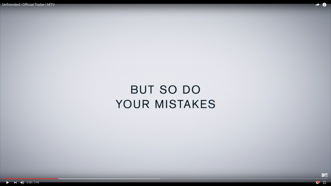
Uploaded has actress names, coming soon and a website link, compared to unfriended that has an actual release date of 'this April' and social media icons and hashtags. We believe that the more conventions you use the more professional the poster . Unfriended looks for simplistic compared to our poster because it has less conventions.In addition, the background is plain where as we have a much more exciting background that is glitched.
Uploaded has actress names, coming soon and a website link, compared to unfriended that has an actual release date of 'this April' and social media icons and hashtags. We believe that the more conventions you use the more professional the poster . Unfriended looks for simplistic compared to our poster because it has less conventions.In addition, the background is plain where as we have a much more exciting background that is glitched.
t r a i l e r
trailer convention diagrams

|

sub genre conventions
|
|
Story line / plot and trailer analysisChristine brown has the perfect life, a loving boyfriend and a great job at a los Angeles bank. But her life becomes not so heavenly when she denies an old woman's request for an extension on her home loan. The woman then cruses Christine, threatening her soul with eternal damnation. Christine sees a psychic's help to break the curse.
The trailer begins with Christine at work asking her boss about the assistant manager position. The trailer is opened with a soft non- diegetic score. I feel that this prepares and builds tension for the audience. The old lady trying to get her house back. |
characters
Christine Brown
|

Clay Dalton
|

Mrs. Ganush
|

Rham Jas
|

Shaun San Dena
|
costumeProtagonist clothing: High middle class work clothing.

Antagonist costume: Muted, baggy, old clothes

|
weapons / propsThe iconic prop used: The crused button

|
lighting
Bright natural day lighting used for the equilibrium.

Low -key lighting : disequilibrium
|
setting
Busy city / office building / car park / bedroom

Witches house / grave yard / Demon experts mainson

|
|
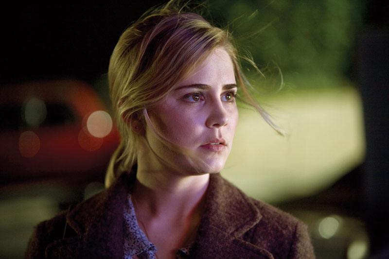
story line / plot and trailer analysisBased on a true story. In Enfield ponders end london 1977. Young teenager Janet Hodgson and her family face difficulity when Janet and her siblings play ouija. The house becomes filled with a demonic spirit that enter the little girl Janet and their only hope to save the poor girl is to call in the demon experts Ed and Lorraine Warren to try and find out why the spirit is there what it wants from Janet and how it got there. Can Ed and Lorraine Warren find rebuke the demon in order to help the family and can they save the family house ?
|
characters

Janet Hodgson
|

Ed Warren & Lorraine Warren
|

Peggy Hodgson
|

Bill Wilkins
|

Demon Nun
|
costumeLow working class commoner outfit.

Baggy nun outfit for the protagonist. Red night dress for main protagonist.

|
props / weaponsIconic prop: Holy cross

|
lightingBright lighting used for the equilibrium.
Dark lighting used for the attempt scene of the trailer.

|
uploaded convention diagrams

|

|
how we have used/followed conventions
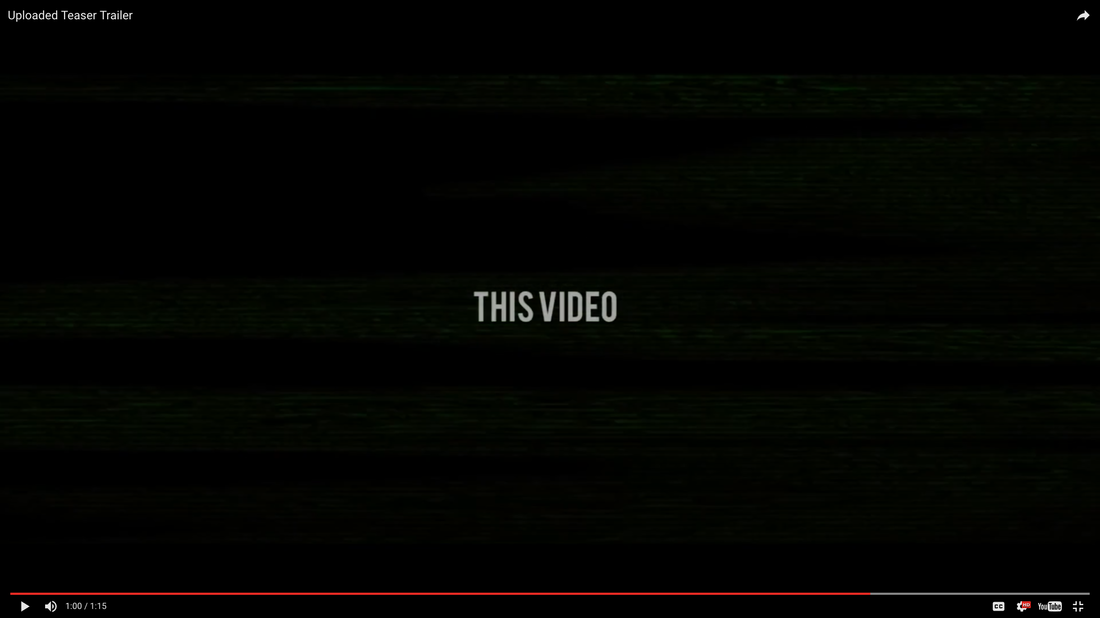
Overall, we have followed all conventions of an horror trailer. We have also used all conventions from of our sub genre supernatural. We have done this using iconic and symbolic codes like the holy cross and the Bible.
The pacing and length of our trailer can be described as medium in terms of intensity.
Our trailer was set In a house/ apartment different types of lighting was used in our trailer , from natural sun light, to studio light and torch light for the night time scenes.
during the filming of our trailer we made sure that we took all the conventions of a trailer and the supernatural sub genre into consideration so that our trailer could be realistic as possible.
how we HAVE DEVELOPED CONVENTIONS
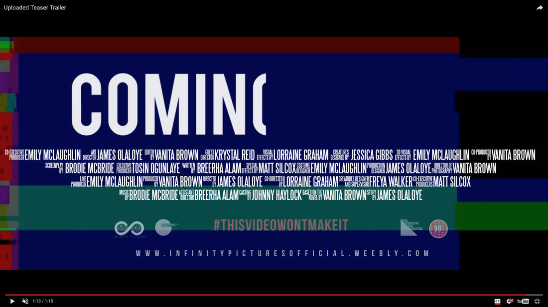
The logo of our trailer was developed. Instead of presenting logo with a translation like fade or wash we edited to logo so that it could be glitch into the screen. This made the start of our trailer instantly appealing because the audience are use to seeing normal production logos appear on the screen.
The we edited our equilibrium so that the characters could be scene recording themselves and the actual footage of them recording themselves was shown. We wanted the trailer to be as realistic as possible.
The we edited our equilibrium so that the characters could be scene recording themselves and the actual footage of them recording themselves was shown. We wanted the trailer to be as realistic as possible.
HOW WE challenged CONVENTIONS
The most chanllenged convention in our trailer was the fast face montage. Instead of using many different clips for the montage we used one clip, repeated it and used it to seperate the other shots. This gave our trialler a unique appeal.
Comparison with real media text
regualation rating

|

|
logo

|

|
equilibrium
lighting

|

|
setting

|

|
costume

|

|
props

|

|
characters

|

|
captions


|

|

|


|

|

|
|

|
disequilibrium
editing, pacing and tension

|

|

|

|

|

|
conclusion
To conclude, all of our products follow and used every convention. We have mostly challenged convention rather than develop conventions because we wanted to make our products as unique as possible.
When we made comparisons to real media text, we noticed that our products were very similar with regards to structure, composition, themes and the way we used of conventions. This means that our products are suited to our chosen sub genre supernatural as well as the main genre which is horror.
When we made comparisons to real media text, we noticed that our products were very similar with regards to structure, composition, themes and the way we used of conventions. This means that our products are suited to our chosen sub genre supernatural as well as the main genre which is horror.
