QUESTION: HOW EFFECTIVE IS THE COMBINATION OF YOUR MAIN PRODUCT & ANCILLARY TEXTS?
This task we are required to discuss how & if effectively our media products (Film Trailer, Film Poster, Film Magazine Front Cover and Team Website) effectively work together with continuity and smoothly as a promotion package for a new horror movie. We are required to specifically see how our media products look familiar and how they belong and possibly represent a brand identity and continuity. My intention of this task is to set examples of real media products that belong to a marketing campaign, by doing this I then set my own examples of brand continuity within our media products and create a range of visual products such as billboards and games in order to answer the question and display the brand identity within our media products.
CROSS MEDIA CONVERGENCE(CMC)
Cross media convergence is a marketing and distribution method which occurs when two companies from different media sectors come together in order to promote or distribute a product/film. In terms of the launch of the film, this is potentially the most essential stage of the campaign/ promotion of a movie package. in order to build awareness of this product/upcoming film it has to be advertised, through trailers, cross promotions such as console games, toys and clothing and through press releases such as bus posters, cinema posters and national newspaper adverts. The product/film can also be distributed through other platforms.
SYNERGY
In order for films to be successful, it has to access a variety of audience with various different media platforms, due to the fact that the more platforms it is presented on, the higher the chance of that film becoming successful. Countless amounts of successful horror invest an abundant amount of money on marketing their product. The more exposure that the film recieves then the more profit is generated through box office revenue.
BRAND IDENTITY
Brand Identity refers to the overall way in which a company or organisation is seen or distinguished. Brands are identified thorough unique and specific elements such as fonts, colours, design, logotype, name or symbol. These elements allow consumers to easily identify different brands with the use of these elements. for example the Red "S" in the yellow pentagon identifies the superman logo, which is the second most identified logo in the world.
Now I am going to present multiple examples of Film Marketing Campaigns from existing Real Media Texts.
The resident evil franchise is a very successful one & is a very much a famous example that uses synergy and brand identity really well. This is a horror Franchise which originated from a video game that was released in 1996, titled "Resident Evil". Six years later the first film was released titled "Resident Evil". This franchise includes a variety of ventures including Video Games, Novels, a themed Restaurant, action figures or models & much more. The resident Evil franchise has 5 films (a Pentalogy) & across all those films the overall gross the have had combines is $302,260,100.

These are produced in order to promote and advertise a film, when these are often printed by the studio in several poster variations that vary in size and content for various domestic and international markets. They normally contain an image with text and have synergistic qualities.

|

|

|
A trailer (also known as a preview or coming attraction) is an advertisement or a commercial for a feature film that will be exhibited in the future at a cinema, the result of creative and technical work. The trailer format has also been adopted as a promotional tool for television shows, video games, books, and theatrical events/concerts.
|
Resident Evil
|
Resident Evil: Extinction
|
Resident Evil: Afterlife
|

The "Resident Evil" film franchise roots from the video game series, known in Japan as Bio Hazard, is a survival horror video game developed and released by Capcom originally for the PlayStation in 1996, and is the first game in the Resident Evil series. The franchise is owned by the video game company Capcom. The franchise focuses around a series of survival horror video games, but has since branched out into comic books, novels, and novelizations, sound dramas, live-action films, animated sequels to the games, and a variety of associated merchandise, such as action figures. Video games can be a great way to draw in the gaming community/audience towards a film.

|

|

|

|
The Resident Evil novel series consisted of a books all written by S.D. Perry, there were 7 actual books released as part of the series but there were also spin offs still made by S.D.Perry. However The novel for the first film, titled Resident Evil: Genesis, was published over two years after that film's release, while the Extinction novel was released in late July 2007, two months before the film's release. There was also a Japanese novelization of the first film, unrelated to DeCandido's version, written by Osamu Makino. Makino also wrote two novels based on the game Resident Evil: The Umbrella Chronicles.

|

|

|

|

|

|
In 1997, Marvel Comics published a single-issue prologue comic based on the original Resident Evil, released through a promotional giveaway alongside the original PlayStation game. In 1998, WildStorm began producing a monthly comic book series based on the first two games, titled Resident Evil: The Official Comic Magazine, which lasted five issues. The first four issues were published by Image, while the fifth and final issue was published by Wildstorm themselves. Each issue was a compilation of short stories that were both adaptations of events from the games, as well as related side-stories.

|

|

|
Over the years, various toy companies have acquired the Resident Evil license and each producing their own unique line of Resident Evil action figures or models.These include, but not limited to, Toy Biz, Palisades Toys, NECA and Hot Toys.

|

|
The Resident Evil film series, known in Japan as Biohazard (バイオハザード ), is a Japanese computer animated bio punk horror film series based on the Resident Evil survival-horror video game franchise.
|
|
|
|
Resident Evil theme restaurant Biohazard Cafe & Grill S.T.A.R.S. opened in Tokyo in 2012. Halloween Horror Nights 2013, held at Universal Orlando, featured a haunted house titled Resident Evil: Escape from Raccoon City, based on Resident Evil 2 and Resident Evil 3: Nemesis.

|

|

|
The Silent Hill franchise is very successful franchise & it is an amazing real media text example synergy & cross media convergence. This horror film also originates from a video game franchise that came out in 1999 & then branched out into a film. Silent Hill is best well known as a series that focus best on a range of different themes such as Euthanasia, Religion, Corruption and much more. The Silent Hill franchise includes 8 video games, 2 films, 9 comics and 4 novels.

|

|

|

|
Silent Hill: Revelation 3D
|
Silent Hill (2006)
|
|
|
|

Through the use of synergy and cross media convergence the franchise has been able to promote the release of Silent Hills, in this case they have produced merchandise, including a figure of the well known character Pyramid Head in action as well as other excess figures.

|

|
This franchise has released a total of 8 video games which emphasises the popularity and success the franchise had, though critics criticised the quality of the games as the year went by, many still say it was an impressive run of games. This franchise has a heavy use of cross media convergence as it can produce video games such as these and the fact that they use iconic logos & imagery techniques mean that they can easily be recognised.

|

|

|

|
The silent hill franchise has been home to 4 different novels as well as 9 differet comic books which are all based off the films & the video games. This franchise has a heavy use of synergy this is shown through the fact that they can produce publications such as these. With the dark setting and the iconic logo, the Silent Hill franchise is also easily recognised

|

|

|
This section consists of me explaining the continuity using visuals between our 3 final products and our website.
Example:

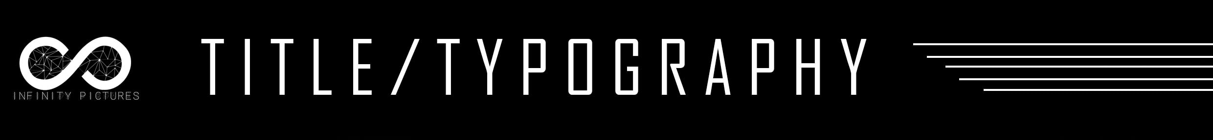
In every product there is the exact same title/typography for the amazing spiderman, this shows continuity and brand identity within the franchise as it is clearly displayed. Within the main products are being ancillary texts being used within a promotional package, it makes it much more effective when promoting the movies release date. This is done so that when the text is displayed before the audience on different promotional platforms such as billboards or a soundtrack the audiences automatically identify the brands that is being represented & link it to a primary product; for example a film or a game.

|

|

|
Our Piece's

The inclusion of the same title and similar typography on our three products and our website makes our brand identity easy to be identified as well as easily recognised through the media texts. These elements will help audiences identify the brand being promoted, thus collectively working together within a promotional package to promote a new movie, however it can be used to promote other media.

|

|
Examples:

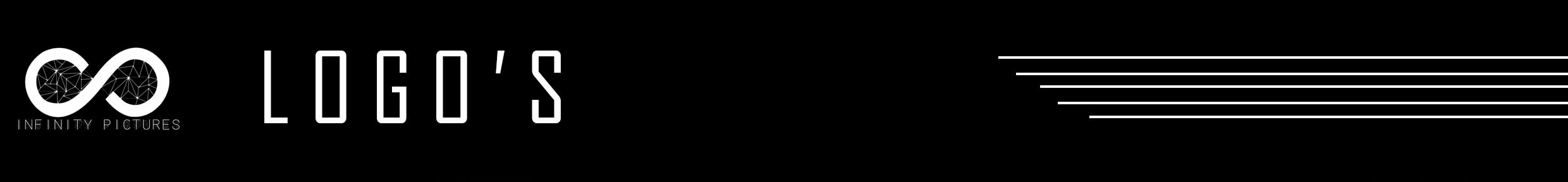
Within our products the logo is presented on the poster, trailer and website. This is done as brand identity and continuity is presented through the texts. Though it may not be part of the film, the production company still represents the film that is being promoted, meaning audiences are still able to identify the movie.

|

|

|

|
Our Logo
|
|

|
Our production company logo is presented on the magazine, trailer and website. This assists in brand identity displays continuity between text. Though it may not be part of the film, the production company still represents the film that is being promoted, meaning audiences are still able to identify the movie.

Examples:

Brand identity and continuity can be very well manipulated when the films primary antagonist is in use, a perfect example of this is within the film The Dark Knight: Rises in which there is a promotional package using the Joker, The joke is an iconic character not only within cinema but within comic books meaning that audiences are very familiar with this antagonist. This notoriety means that audiences will easily recognise the promotional package as well as the film. The Joker is an iconic & very important part of the film, so the use of The Joker on the poster, magazine, trailer and poster, brand identity and continuity is clearly represented and through the use of The Joker the promotional package will be effective.

|

|

|
Our Piece's:
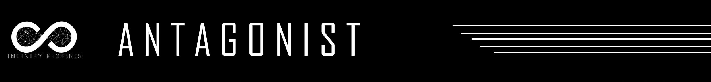
Our piece's brand identity and continuity is clearly defined within my media products. This was done through the use of primary of the antagonist within our film known as "White Face" . Each one has a similar type of lighting besides my poster. However the fact that the antagonist is on the poster and the magazine presents synergy & means it will also help promote a new film as there is cross platform recognisablility. Due to the magazine used within the main image of both texts means that it becomes clear that the face is one of the main icons of the new film, so when audiences sees the character an instant connection is made between the antagonist and the movie.

|

|

|
Examples:
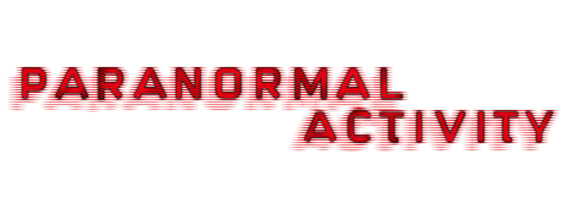
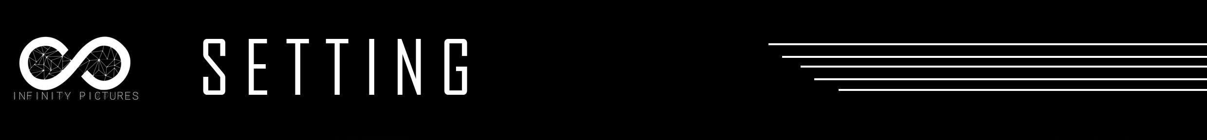
These posters below clearly display the location in which the film will take place. In paranormal activity the location is being used in the poster & trailer, based on observation we can safely assume the location is a normal house, this aspect of the film was used in all promotional packages as the audiences will easily recognise the setting when being promoted as though not very often, the settings is one of the icons of the movie, thus representing brand identity and continuity.

|

|

|
Our Piece's
The use of the house is present within the trailer & within the magazine, it may not be a very major element within the film, but it still however represents continuity between my texts, and with the house present on promotional products such as banners and billboards, its made clear that they belong to the same promotional campaign, and audiences instantly know what movie is being promoted.

|

|

|
Example's:
Often within media products similar colour schemes, makes it much more easier to identify continuity within the brand. This also assists in making the media look identical,it also acts as an effective tool for marketing as other promotional products are likely to have the same colour scheme, such as bus posters, banners and merchandise.

|

|

|
Our Piece's
The trailer and website & magazine all use the same dark green glitch style, which represents continuity as well as a brand identity. This dark green colour can also be used within an effective marketing campaign to promote the film, through the colours audiences recognise the movie and are reminded to go see the movie in release date.


|

|
As for this section of the Evaluation, I am going to create a wide variety of visual products such as posters, games, toys, apps and merchandise in order to display a sense of brand identity found in our final 3 three products.

|

|
These promotional posters are based on the original posters for the film, but adapted to suit other plat forms, I ensured that for these the most necessary components are the ones that are present, the ones that I discussed earlier such as the antagonist, title/typography & setting in some cases.


|


|

Here I have created & designed game covers for the video game for uploaded, I also designed custom controller covers for each platforms. Both the Game & Controller covers contain he antagonist, this is as the antagonist plays a major role not only in the video game, but also the trailer.. As you can see all designs merge the green & purple colour schemes that will be exhibited through out the promotional package, to solidify brand Identity as well as CMC & Synergy.

|

|

|

|
The main focal point of this book is the antagonist, It, unlike the earlier packages contains the green night vision colour scheme, and through the typography stating "part 1" this also suggests that this would be an on going series that would be able to bring in extra capital before, during & after the release of the film.

|

|
This section consists of the placement of my product across multiple platforms that the film could be consumed on, each with somewhat different posters, and images this is as the CMC & brand identity is strong enough to a point where the film can still be identified. As well as the fact that different images show each platform something that they not have seen form the film yet

|

|

|

|


This is a soundtrack/Album cover that I produced & would be sold digitally, this is as hard copies are becoming more obsolette nowadays. I made the album cover very radical & distorted with many overlapping covers & figures. This grungy style that I adapted had a very positive outcome on the covers final outcome.

|

|
This takes Sky TV features & places our final outcome in situe. Showing what it would look like if our film could actually be rented on sky TV.

|

|


|


|
IN CONCLUSION
I feel as that my final outcomes, the poster, magazine, trailer and our ancillary text, the website work as a cohesive unit works extremely well & effectively as they compliment each other, I also feel as it would work effectively as a promotional package. Our main products follow a principle in which our ancillary texts contain very similar elements which easily represent the identity of the brand as well as it's continuity. This includes a wide variety of elements such as the setting, typography, title, and the antagonist & protagonist. These elements provide evidence to why and how our products and ancillary texts work together to be effective. Our Promotional visual products have the same effect, from TV to merchandise, elements from each individual product is in some shape, way or form identical to all the others, meaning audiences will easily recognise the content if they were released for a promotional package, thus representing brand identity, continuity and an effective combination through our main products and ancillary text.
